
The C-Town logo

Echolocation in Practice
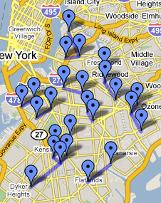
Proximity-annotated map of Brooklyn's C-Towns
The downward repetition of the "town" in the C-town logo often goes unnoticed. However, upon closer examination, several questions linger. Why does the repetition stop at 1.5 towns? What is implied in the towns beyond? What are the sign's creators trying to tell us? It is a simple gesture that hints at an iceberg of hidden supermarket truth.
We feel that the "town" repetition suggests an underlying typology of C-town supermarkets in general. C-Town Echolocation is our principal hypothesis; we posit that the "town" repetition is an undiscovered marker of C-town proximity, among other charecteristics. Even within the supermarkets themselves, the aisles insinuate hidden theories and schema. Where do the hierarchies of shopping routes fall? Where do the proprietor's designs synergize with the shopper's desires?
This project will create new signifiers for supermarket phenomena, remapping the C-Town experience. C-town echolocation gives us our macro-geographic context; each "Town-town-town..." beacon situates the supermarket wanderer in the C-Town world. Once inside, we will be their guides, providing the cognitive map at the micro level of the supermarket as well.
For the Conflux festival, we (Jeff Sisson and Bennett Williamson) will create a clearinghouse for C-Town information, including an interactive version of the echolocation map, a glossary of contemporary grocery store terminology, and a reprogrammed map of C-Town's interiors. All of these tools can be printed out for use in situ. To demonstrate this new understanding of C-Town, we will give two or three live tours of select C-towns, tracing the contours of C-Town's hidden truths.